Chapters
- Signup Form Builder: Design Forms
- Build and Publish Landing Pages
- Build and Embed Signup Forms
- Create and Display Popup Forms
- Create and Position Slide-in Forms
Contents
the email tool that makes email marketing simple


Signup Form Builder: Design Forms
Published: · Last updated: · By Marcus Biel
In brief
Learn how to use Maildroppa's visual Signup Form Builder to choose templates, arrange content, style fields, assign tags, connect flows, preview, and save.
The Signup Form Builder is the visual editor for all Maildroppa signup forms and landing pages.
You can use it to arrange layouts, add text and images, configure subscriber fields, change colors and fonts, assign tags, and decide what happens after someone submits the form. The canvas shows the result while you work, so you do not need to write any code to design a complete signup experience.
Maildroppa uses the same builder for four form types:
- Landing Pages are complete standalone pages that you publish and share with a link.
- Embedded Forms are placed directly inside a page on your website.
- Popups appear above your website and can also be opened from a page element.
- Slide-ins appear at a selected edge or position of the browser window.
This guide explains all functions shared by these form types. The linked guides explain only the settings and steps that are unique to each type.
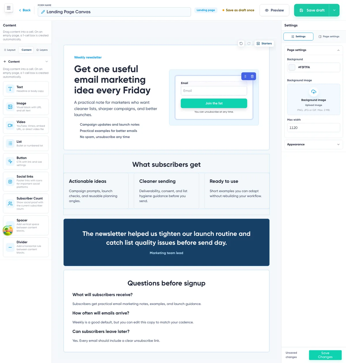
Opening the Signup Form Builder
Open “Signup Forms” in Maildroppa. You can then click “Create Form” to create a new Landing Page, Embedded Form, Popup, or Slide-in.
To continue working on an existing form, click its name or choose “Edit Form” from the three-dot actions menu in the Signup Forms Overview.
Give the form a clear internal name. Names such as “Homepage Newsletter”, “Webinar Popup”, or “Summer Lead Magnet” are easier to recognize later than generic names such as “Form 1”. The form name helps you manage the form in Maildroppa and is not automatically shown to visitors.
Understanding the Builder
The builder is divided into four main areas.
The top bar contains the form name and the main actions. Here you can return to the overview, preview your work, and save it. Landing Pages also show their draft and publication controls in this bar.
The left sidebar contains “Layout”, “Content”, and “Layers”. Use it to create the structure, add new elements, and manage everything already placed on the canvas.
The canvas is the central work area. It shows the current page or form. Click an element to select it. You can also drag elements to a different location or add new elements from the left sidebar.
The right sidebar contains “Settings” and “Page settings”. “Settings” changes the selected element. “Page settings” changes the overall background and design defaults.
On smaller screens, the sidebars open as panels using the “Content” and “Settings” buttons. The available functions remain the same.
Starting with a Template
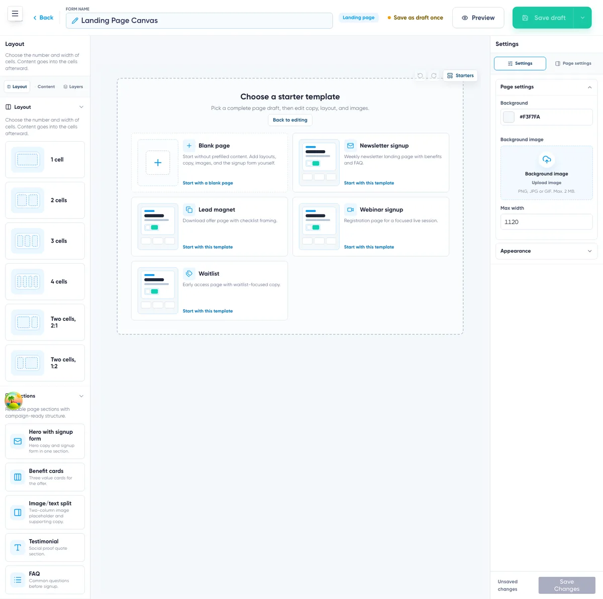
When you create a form, the builder offers starter designs for the selected form type. You can begin with a blank design, use the standard form, or choose a ready-made template.
Templates provide a starting layout, colors, typography, and example content. They do not limit what you can change later. After selecting a template, every element can still be edited, moved, duplicated, restyled, or removed.
Each form type has templates suited to its purpose. For example, Landing Pages include complete Newsletter, Lead Magnet, Webinar, and Waitlist page designs. Embedded Forms, Popups, and Slide-ins have their own compact starter designs.
If you are unsure which template to choose, select the one whose structure is closest to your goal. Changing text, colors, and images is usually faster than building the same structure from a blank canvas.
Creating the Layout
Open “Layout” in the left sidebar to add a new row of cells. The available layouts include:
- One cell
- Two, three, or four equal cells
- Two cells with a 2:1 ratio
- Two cells with a 1:2 ratio
Click a layout to add it at the current insertion position, or drag it onto the canvas. You can then place content inside each cell.
Select a box or column to adjust its size, spacing, alignment, background, border, and padding in the right sidebar. For multi-column layouts, you can also change the relative column widths.
Use layouts to create a clear reading order. A single column works well for compact signup forms. A two-column layout is useful when an image, list of benefits, or event information should appear next to the signup form.
Adding Content
Open “Content” in the left sidebar to add individual content blocks. You can click a block to insert it or drag it to the desired position on the canvas.
The builder provides the following content blocks:
Signup form — Contains the subscriber fields and submit button. A design needs one signup form block before it can be saved as a working form. Once the block is present, it is no longer offered as an additional content block.
Text — Adds headings, paragraphs, or other formatted text.
Image — Adds an image from a URL, an upload, or the Maildroppa media library. You can provide alternative text, add a link, and control dimensions, aspect ratio, cropping, focal point, rotation, and flipping.
Video — Adds a YouTube or Vimeo video, an embed URL, or a direct video file. You can also configure a preview image and the appearance of the play button.
List — Adds a bulleted or numbered list. Edit the entries and control the marker color, spacing, typography, and alignment.
Button — Adds a link button with configurable text, URL, size, width, colors, border, typography, and alignment.
Social links — Adds linked icons for services such as Facebook, Instagram, LinkedIn, TikTok, YouTube, or your website.
Subscriber counter — Shows the current number of confirmed subscribers. You can add an offset, change the label, and style the number and text.
Spacer — Adds controlled empty space. Desktop and mobile spacing can be set separately.
Divider — Adds a horizontal line with configurable color, thickness, width, style, alignment, and spacing.
Landing Pages also provide complete reusable sections. These are explained in the Landing Page guide.

Selecting and Arranging Elements
Click an element on the canvas to select it. Its settings appear in the right sidebar.
The controls on or near the selected element let you move, duplicate, or delete it. You can also drag an element to another cell or position. A placement indicator shows where it will be inserted.
Open “Layers” when the page contains many nested boxes, columns, and content blocks. The Layers panel shows the complete structure in a list. From there you can:
- Select an element
- Rename it for easier identification
- Move it up or down
- Drag it to another position
- Lock or unlock it
- Duplicate it
- Delete it
Locking is useful when a finished background, image, or section should not be moved accidentally. Unlock the layer when you want to edit or reposition it again.
Use “Undo” and “Redo” in the builder toolbar to step backward or forward through recent design changes.
Editing Text
Click inside a text element to edit the content directly on the canvas. The text toolbar provides paragraph and heading styles together with common formatting options.
Depending on the selected text, you can use bold, italic, underline, strikethrough, subscript, superscript, alignment, bulleted or numbered lists, links, and emojis. Selected-text settings also let you adjust typography and colors without changing every other text element.
Use the global typography settings under “Page settings” when all headings, body text, links, or buttons should share a consistent style. Use the selected element settings when only one block should look different.
Configuring the Signup Form
Select the signup form block on the canvas to open its settings. The available sections cover the progress bar, subscriber counter, fields, hidden tags, form container, input fields, and submit button.
Subscriber Fields
The email address is the central field of a signup form. You can also add subscriber fields that exist in your Maildroppa account.
For each field, you can change the label and placeholder, decide whether it is required, and choose whether the field label is shown. Fields can be reordered by dragging them or using the movement controls.
Only ask for information you genuinely need. Shorter forms are faster to complete, while additional fields are useful when the information will be used for segmentation or personalization.
Hidden Tags
Hidden tags are not displayed to visitors. When someone signs up through the form, Maildroppa automatically assigns the selected tags to that subscriber.
This is useful for identifying the source or interest behind a signup. For example, a form for a webinar can apply a “Webinar” tag, while a lead magnet form can apply a tag for the downloaded topic.
Progress Bar
The progress bar can be disabled or displayed as a percentage or two-step indicator.
For a percentage indicator, you can change the text, colors, font size, weight, and alignment. For a two-step indicator, you can edit the labels for both steps and choose active and inactive colors.
A progress indicator can help explain that submitting the form is the first step and confirming the Double Opt-in email is the second.
Subscriber Counter Inside the Form
The signup form can display the current number of confirmed subscribers before or after the submit button.
You can add an offset, write a label, choose the position, and adjust the typography and alignment. The offset is added to the confirmed subscriber count shown by Maildroppa.
This form counter is different from the standalone “Subscriber counter” content block. Use the form setting when the number should be directly connected to the submit area. Use the content block when the counter should appear elsewhere in the design.
Form, Input, and Button Design
The “Signup Form Block” settings control the container around the fields, including its background, border, corner radius, and spacing.
The input settings control field backgrounds, labels, text, placeholders, borders, and spacing. The submit button has separate settings for its text, typography, colors, border, dimensions, and alignment.
You can click the progress bar or submit button directly on the canvas to open the settings for that part immediately.
Changing the Overall Appearance
Open “Page settings” in the right sidebar to change the overall design. For Embedded Forms, Popups, and Slide-ins, these settings apply to the form canvas rather than a complete hosted page.
You can configure the main background, background image, maximum width, and mobile spacing. The appearance settings define defaults for:
- Body font and text color
- Link color, underline, and hover color
- Heading font, color, weight, size, and line height
- Buttons
- Boxes, borders, corner radii, gaps, and padding
- Mobile page padding and the point at which columns stack
These defaults keep the design consistent. Individual blocks can still override them when needed.
Connecting a Signup Flow
Every form is connected to a Signup Flow. The signup flow controls the subscriber journey after the form is submitted:
- What the visitor sees immediately after submitting the form
- Which Double Opt-in email is sent
- What happens after the subscriber confirms the email address
Open the signup flow control in the builder header to see the currently assigned flow. You can select another existing flow, edit the selected flow, or create a new one.
A signup flow can be used by several forms. If you edit a shared flow, the change affects every form using it. Maildroppa therefore lets you choose whether to edit the shared flow or create a separate copy for the current form.
Previewing and Saving
Click “Preview” to check the complete design and signup experience before making it public. Preview is useful for checking long text, image proportions, field order, button labels, and the overall balance of the form.
For Embedded Forms, Popups, and Slide-ins, click “Save changes” when you are ready to store the current version.
Landing Pages use draft and publication controls in the top bar. They can be saved without being published, and changes to an already published page remain unpublished until you publish them. The complete workflow is explained in Building and Publishing a Landing Page.
After saving, return to the Signup Forms Overview to activate and embed a website form or to manage a published Landing Page.
Continue with Your Form Type
The common design work is now complete. Continue with the guide for the form you are creating:
Ready to Send Better Emails?
Stop juggling bloated tools or overpriced plans. Maildroppa offers personal support, privacy-conscious controls, and powerful email marketing - starting free forever.
No credit card required. No time limit.